Power BI – December Summary
Due to the turn of the year this entry appears a bit late. Nevertheless, I would like to briefly present the developments on “Power BI” in the last month. A big step was made in the topic of usability, so that navigation and input are now even easier
Reporting
There are many innovations in reporting.
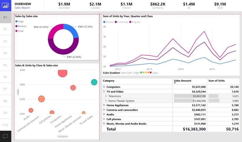
The first thing to mention here is the “Smart guide”, which helps align elements with others. This will now add dotted red lines to help with alignment.
The popular ArcGIS Maps, which can display content on a map, have been extended by a few points.
The selection bar is now located in the upper left corner, which now also includes the new “Find Similar” function. This function allows to search for similar data to the selected ones in order to plan campaigns, for example. For this purpose, only fields must be selected with which comparisons can be made.
In addition, the list for the countries has been expanded and the boundaries of the countries have become more detailed.
The interface has also been adjusted so that there is now more space in the map.
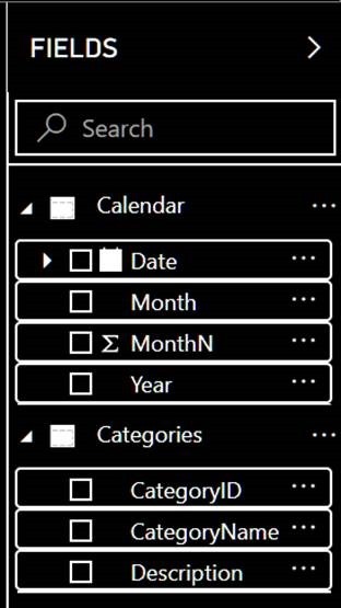
User control has been a big topic for a few months now. Also this month, another area has been made more user-friendly. Now you can also navigate in the fields list using the keyboard and select fields, expand or even expand all fields.
For navigation in the report it is now possible to specify a “tab” order. The default order is the creation order of the elements, which can thus be changed. There it is also possible to skip individual objects.
From the community came the wish to add tooltips for buttons as well, which was implemented immediately. This property can be found under the “Action” tab.
The last point to mention in reporting is the revised “Visual Interactions”. These now scale better and look prettier overall. Now you can also see more quickly if the current visual is filtering others, or just highlighting them.
Analytics
This time, the Analytics section has been extended with the “Live connect support for Q&A” feature. If you use a “live connect service”, you can “ask a question” via the function and thereby create visuals, for example. This makes it easier to create reports, but is currently only available in preview mode.
There are also changes to the Modeling item that expand the input. Thus, it is now possible to zoom in and out of the DAX form bar.
The expanded view of the DAX form bar is also helpful for clarity. This can now fill almost the entire window.
For the data view, the user control has also been enhanced and can now be edited using the keyboard or a screen reader.
Custom Visual
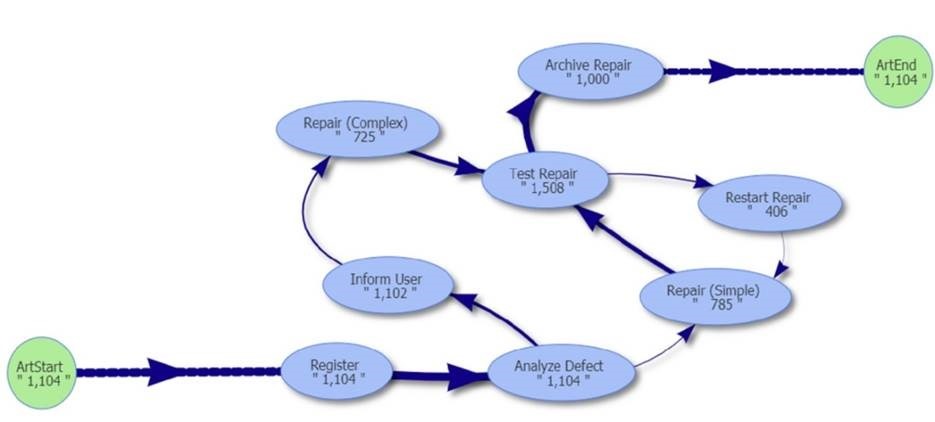
The “Custom Visual” presented this time was the “BIpm: Interactive directed flow graph”, which can clearly display a process.
Connectors
New connectors this time are the “AtScale connector”, which can be used to connect to AtScale sources, and the “Oracle Essbase connector”.
Data preparation
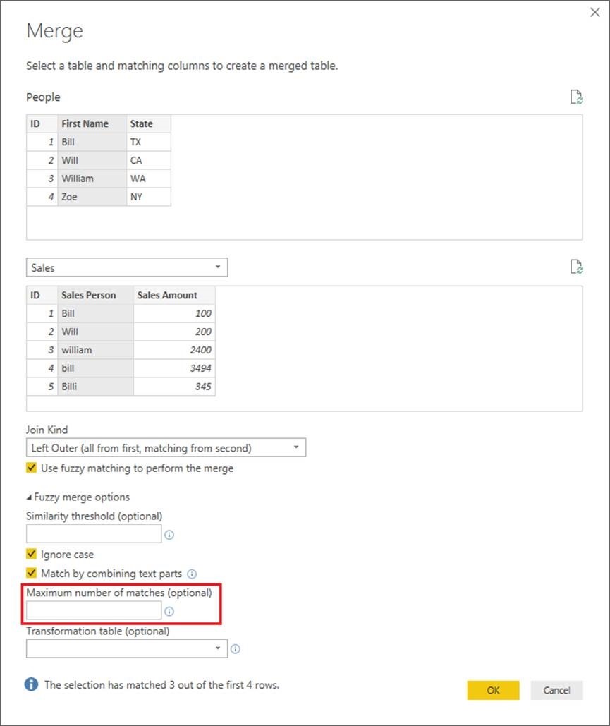
In the area of “Data preparation” the presented “Fuzzy Matching” was extended. It is now possible to specify the number of best hits. Further improvements are currently in progress and will be released soon
Lastly, there is news in the general handling of “Power BI”. It is now possible to set up different contrast modes and thus graphically adjust the software to one’s preferences.
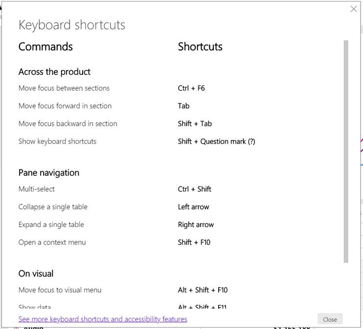
The shortcut info page has been completely renewed and is now clearer.
That’s it for this month. I hope you enjoy the new content.
Until next time.
Tobias Wirths
If you would like to learn more about the possible uses of Microsoft Power BI or need a partner for the implementation, please contact us!


